klu – das inklusive Lerntool
Klu is an inclusive learning tool that is designed for all students who learn together in a classroom – with and without support needs. The 'clou' of this learning tool is that all students can use the tool according to their individual needs. The tool combines an inclusive and barrier-free interface with learning content and tasks that are adapted to different user groups in terms of content and media. It encourages students to perceive their special needs as special skills and supports teachers in addressing the different needs of students in class. The learning content is structured according to areas of competence, which are made up of learning fields. Students and teachers agree on objectives for the semester and weight the competence areas individually for all students with the help of a competence grid. In this way, the tool contributes to contemporary learning with a focus on inclusive and individual content.
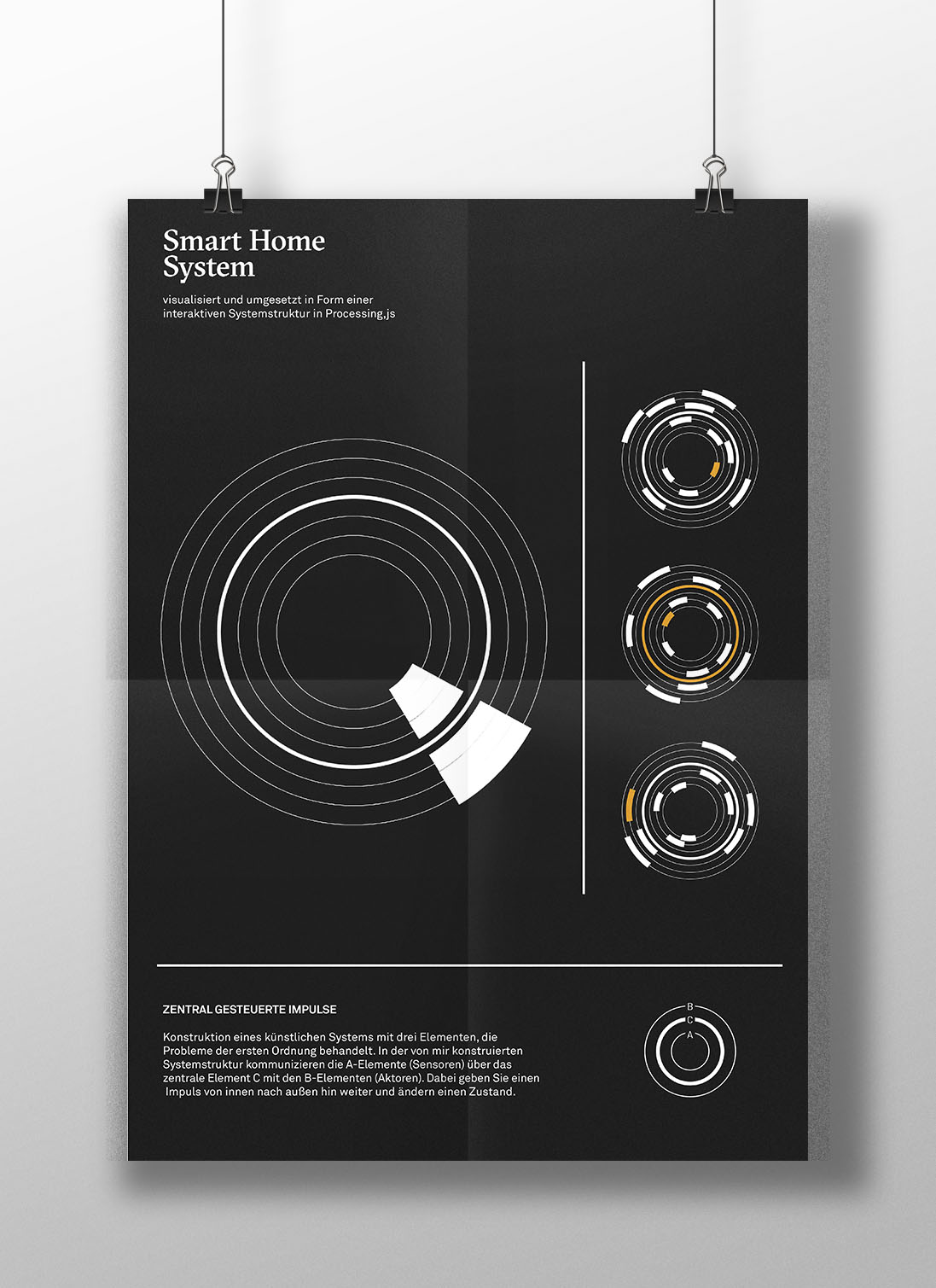
Smart Home System
Construction of an artificial system with three elements, which deals with problems of the first order. In the structure of the system, the A-elements (sensors) communicate with the B-elements (actors) via the central element C. Thereby they transmit an impulse from the inside to the outside and change a state.The impuls is interactive and reacts on the click of the viewer. Created with Processing, a opensource software for code and generative design within the context of visual arts.← Check the screen-capture of the processing-sketch!
gute aussichten – junge deutsche fotografie
According to the magazine Der Spiegel »the most renowned competition for young photographers«, was founded in 2004 by Josefine Raab and Stefan Becht. Each year, professors from all German universities and academies offering photography courses are invited to submit a maximum of five graduation-theses. A renowned jury will select the best portfolios from the entries, which will then be presented to the public nationally and internationally in various exhibitions, campaigns and media. For the competition 2016/17 I was able to participate in the conception & design of the exhibition catalogue.In collaboration with and for Pixelgarten.
Face to Fist
Filmposter I designed for »Face to Fist – Kein Kampf auf Augenhöhe« – a film by Valentin Herleth. Check out the trailer!
StGB — a visual interpretation
The German Criminal Code defines which action is considered punishable and which one for it defined reaction follows. As a rule, an (punishable) action is followed by a punishment. I picked up these two major pillars of the StGb and highlighted them by glyphization. The aim is, to illustrate the complex relationship of action (♦) and reaction (•) in the individual paragraphs on a purely visual level.
Hyperkitsch – die neue digitale KitschkulturBachelorthesis HS Mainz, 2018
Kitsch – an intangible phenomenon that is discussed in different contexts and from different points of view, but so far eludes a consensus definition. Today, kitsch has also conquered a new room – the digital. Hyperkitsch shows the connection between kitsch and culture and its extension in the digital world. Besides its an exploration of material, the digital imitation of material and the impact of the beholder. Based on already existing categorization systems of kitsch and its characteristics (especially by Gustav E. Pazaurek from the 19th century and on the exhibition »Böse Dinge – eine Enzyklopädie des Ungeschmacks« that took place in 2010 in the berlin based »Museum der Dinge«), I have developed eight methods that describe, how cultural objects are turned into kitsch-objects by applying one of the methods on them. I visualized these methods and the transformation of the objects with the aid of 3D-animations within a digital poster-series. For each method there also is a poster which shows its state before and another poster which shows the state after the transformation.
The poster-design is based on the use of stereotype fonts and symbols. The aim of this thesis is to focus on the discrepancy between the real object and its digital imitation. The flattened kitsch debate will thus once again become the subject of discussion. For the exhibition concept of the Bachelor- and Masterexhibition I designed and built a display made of black lacquered wood. With this it was possible to show the work both analogue in the form of the 16 posters (on the left cultural objects before the transformation and on the right kitsch objects after the transformation) and also as a 3D animation on a monitor in the middle of the display. The animation shows the transformation from a cultural object to a kitsch object. Below the monitor is the accompanying booklet explaining the work, as well as postcards to take away for the visitors.
Epic YarnCorporate Identity for a concept of an alteration shop, an atelier and a selling space.
We designed an alteration shop as an concept store and a place where you can work on your own apparel. The store has a young target group such as modern fashion labels and offers stitch courses as well as workstations for individual use. Besides that we built a whole corporate design which is based on the look of sewing patterns which are essential to manufacturing clothing. The lines and the green hue from these sewing patterns are accompanied by the concept of transparency which determines the back of every print product. Contemporary photography and large typography as well as puns on pop culture quotes convey the mood of the brand.In collaboration with Lars Winter.www.epicyarn.de
IEPA #01
This exhibition catalogue was created for an international regular artist-exchange-program of basis e.V. in Frankfurt am Main. The catalogue contains two catalogues which can be viewed in different reading directions. The catalogues are each assigned to one of the two artists and distinguish from each other in color. They are attached to the left and right folds of the cover-wrapper that hold them together.In collaboration with and for Pixelgarten.
Place your work here_, 2016
Corporate Identity for the Bachelor- and Master Exhibition Kommunikationsdesign and the Werkschau of Mainz University, 2016. We invented a concept that was able to give every individual work its very own stage to present itself. The Corporate Identity had to be flexible and catchy without competing with the works presented. Based on this we chose the Placeholder as a major design element. The Bachelor- and Master Exhibition (black) takes place as a part of the Werkschau of the Mainz University (white). This is why it was necessarily to come up with a Corporate Identity that works for both of the events in an individual way and at the same time highlight their connection on a clear visual level. Besides we designed flyers, banners, invitation-cards and an exhibition-catalogue. With the catalogue came several sticker with different works of the graduates, so everyone was able to fill the placeholders in an individual way. In collaboration with Laura Reis.